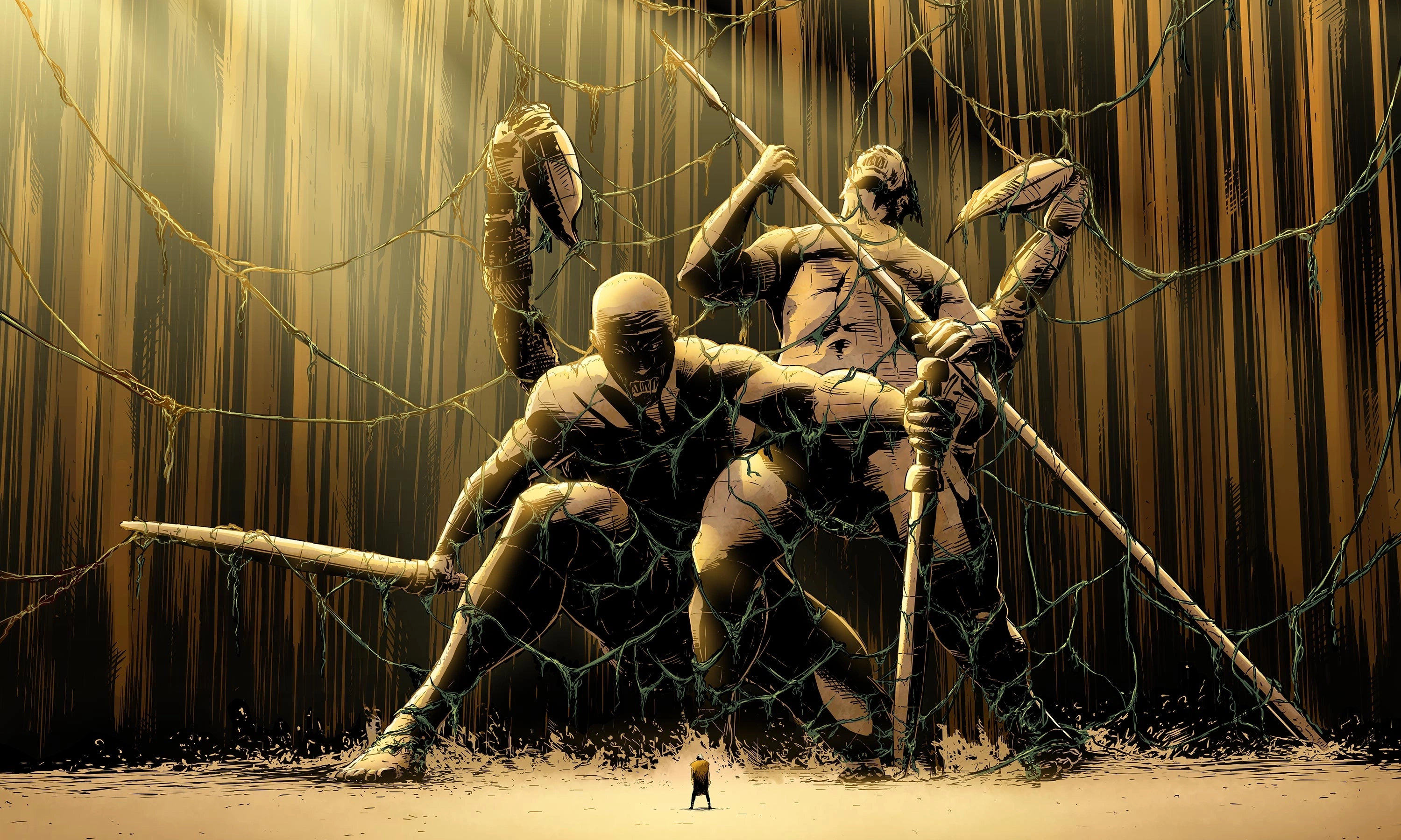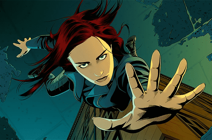
We are flipping through the Corum The Queen of the Swords graphic novel to examine the detailed fantasy artwork inside.
This walk-through focuses on the visual storytelling found in these comic book adaptations. By looking at the panel compositions and cover art, we can see how the painterly aesthetic translates the Michael Moorcock fantasy style into a new medium. It is a great look for anyone who appreciates high-quality illustration and wants to see how these classic sword and sorcery tales appear on the page.
I break down the composition and color choices used throughout this specific graphic novel series. Whether you are a long-time fan of the source material or simply enjoy unique comic art, this review shows why the visual design stands out. I hope this look at the Corum series gives you a better appreciation for the craft behind these pages.
Subscribe for more graphic novel reviews and let me know in the comments if you enjoy seeing these fantasy adaptations.
Join this channel to get access to perks: https://www.youtube.com/channel/UC5Z0aSLnzETqdPjUbnkIfKQ/join
0:00 Returning to the World of Corum
1:44 Lords of Law and Chaos
3:27 The Aloof Enigma of Jhary-a-Conel
6:40 Venturing into the Realm of Monsters
9:58 The Lost Vestiges of a People
11:37 The Seige of the Dark Army
13:01 The Judgement of the Queen of the Swords